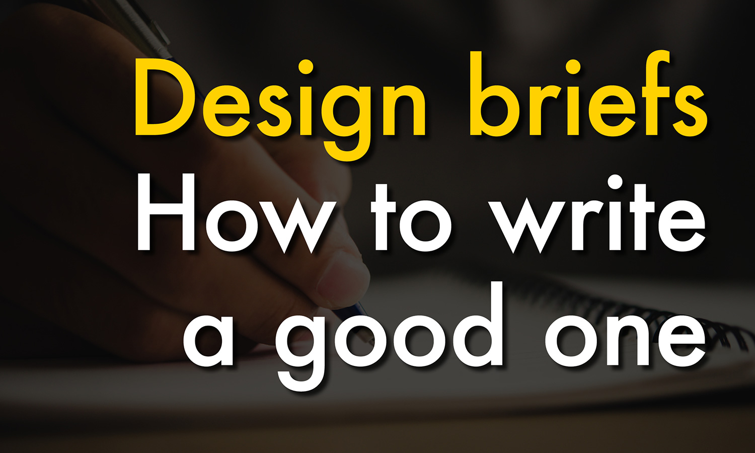
I don’t think that a design brief is difficult to write. Even though some clients can find them a bit daunting. But to ensure that my clients meet their graphic design objectives, and walk away as the end of the job as happy customers, I always try to encourage then start with a well thought out design brief first.

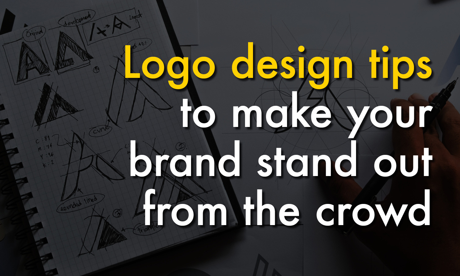
What is a design brief and what is its purpose?

A good design brief should include a clear plan of what your organization is trying to achieve. The design brief you write for your next project, is an opportunity to define the scope of the design work required, establish the key messaging, the budget, the deliverables and the delivery deadlines. In short, by providing this information to your designer upfront, you are making sure that you and your designer are on the same page. Hopefully this will ensure that the project runs smoothly and that you receive a positive outcome for your organization.

What should be included in a design brief?

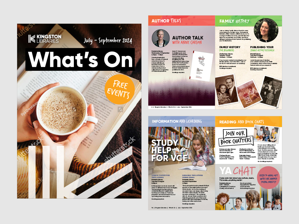
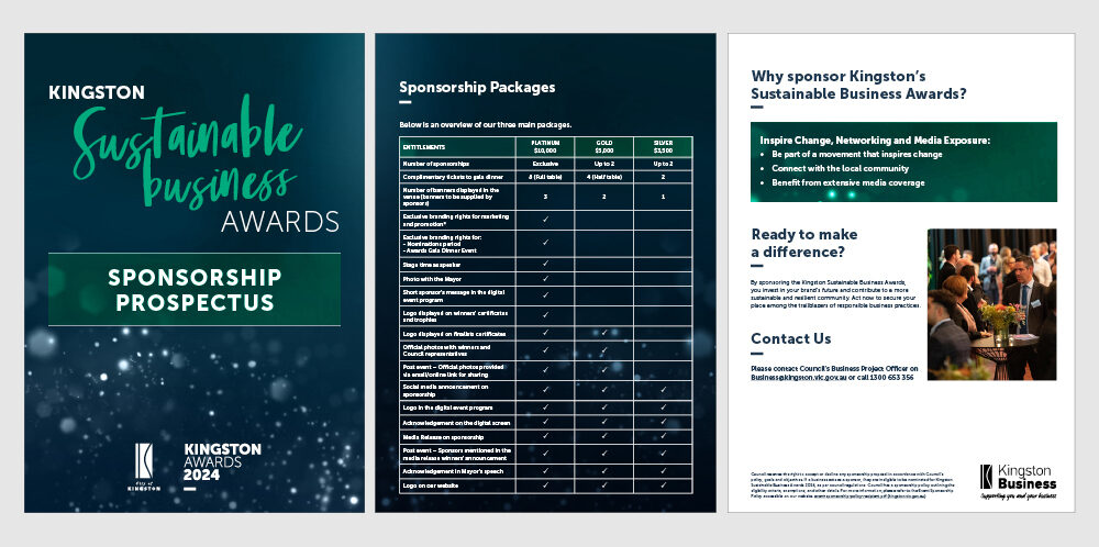
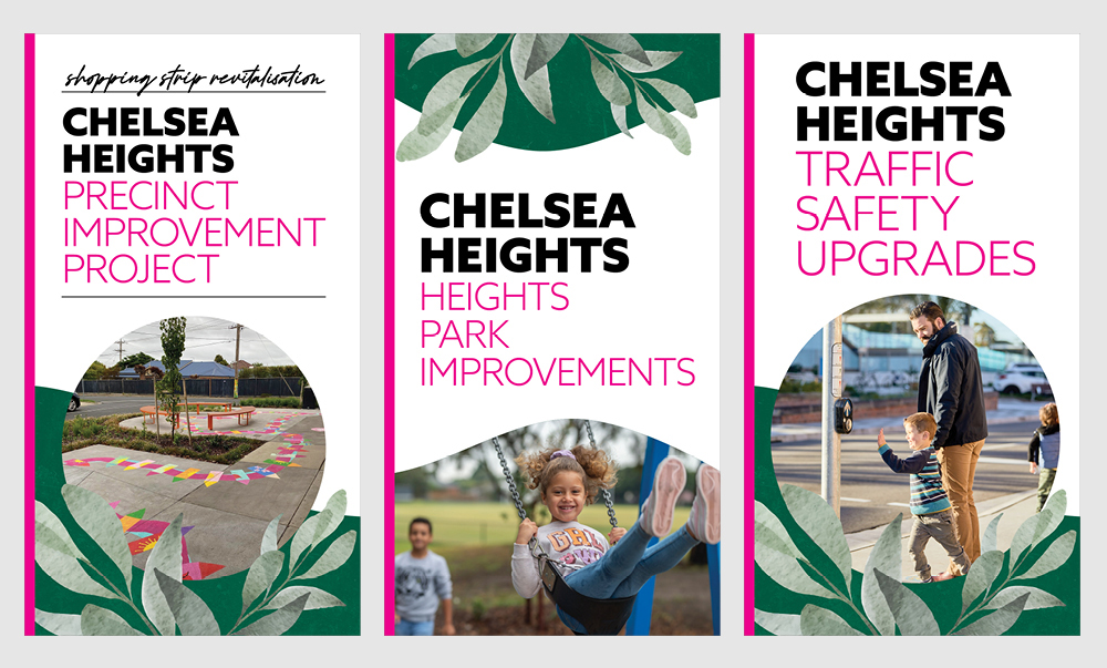
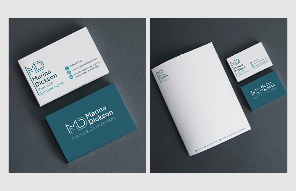
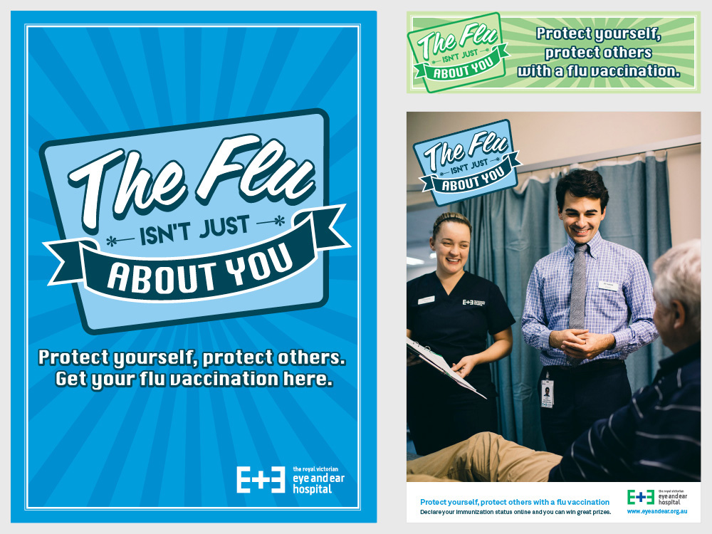
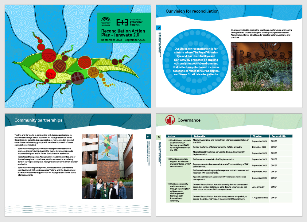
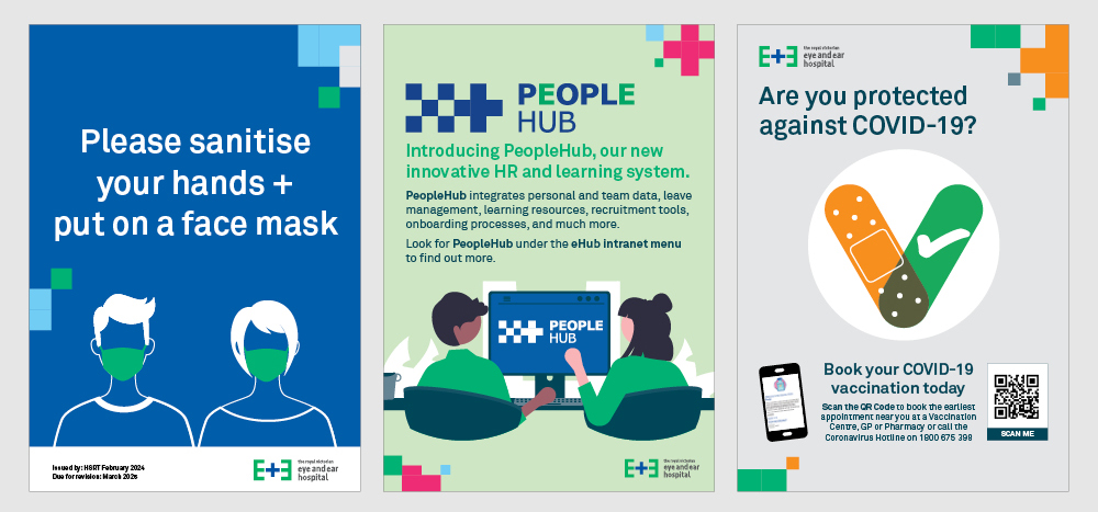
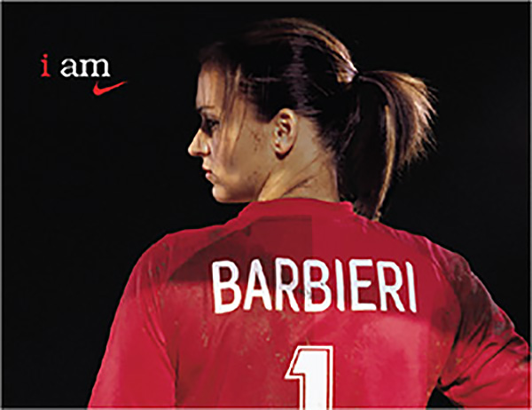
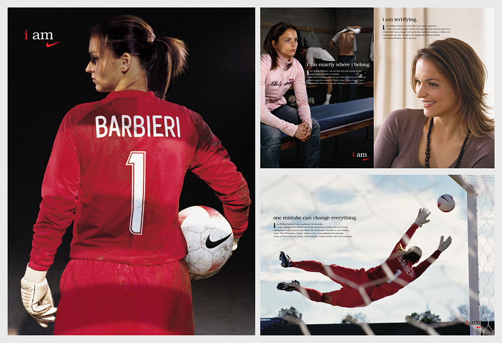
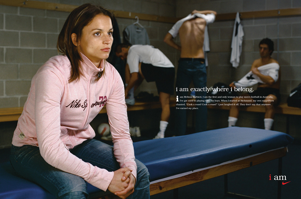
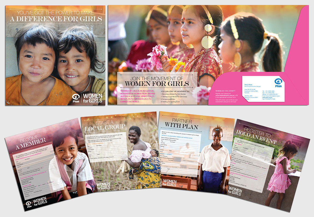
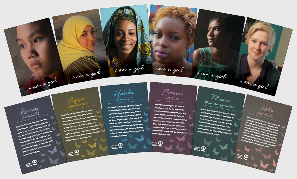
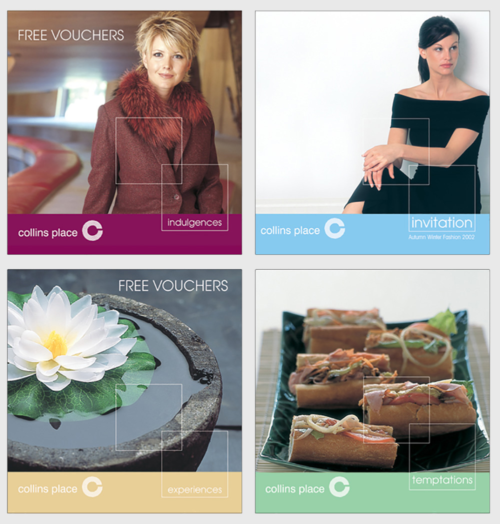
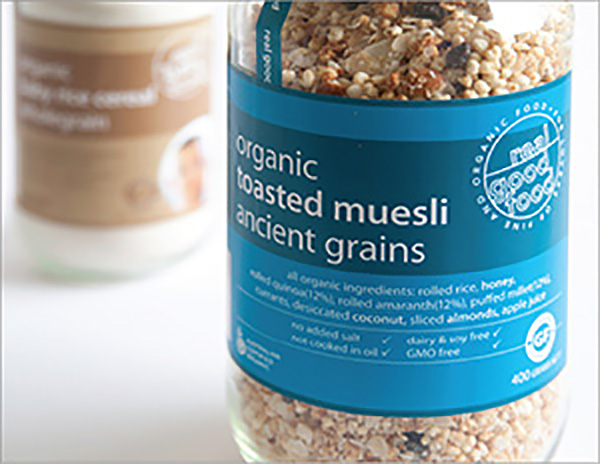
A design brief can be used for all creative projects, whether you are working on a website, logo design, branding, brochure design or any other job requiring a graphic designer. And you don’t need to be a marketing professional in write a good one. Just make sure you include all the relevant information.

Here’s what you should include in your next design brief:

  1. An overview of your business.

    This is especially important if you have not worked with your graphic designer before.

  2. What the objectives of your design projects are.

    Let your designer know what you are hoping the work will accomplish? Are there measurable goals connected with the project?

  3. Who the target audience is for this particular project.

    Having some clear insights into who you are talking to will help to tailor the creative to them.

  4. What is the key messaging and tone?

    What do you want your audience to think or feel about the messaging you are delivering? Do you want them to take any action as a result of your project? Do you have branding guidelines for the graphic designer to follow? If so, make sure you include them with the brief.

  5. Any issues you are facing in relation to your project.

    Are there some problems with your business or current communication material that need to be solved or addressed?

  6. Information about your competitors

    Depending on your project and objectives, this may or may not be relevant. But giving your designer some information into who your major competitors are and what they are up to, can be really useful.

  7. Deliverables required for the project.

    Give the designer a really clear idea of what needs to be delivered, to avoid confusion later. Does that online advertising campaign require 3 banner options or 5? Knowing up front helps the designer to schedule in the appropriate amount of time and quote the job appropriately.

  8. Timeline and budget

    When do you need the job completed by? Producing a timeline to allow for concepts, layouts, photography, illustrations, changes etc. can be useful for all parties to ensure that the project runs on time.

  9. Distribution

    Identify your media assets to ensure effective distribution. Is the project being printed or delivered via digital channels such as your website or social media sites? Does the designer need to organize printing for you? Provide any sizes required or associated specifications.

Conclusion

Writing a design brief does not need to be difficult or overwhelming, and the process of writing a brief can help you really clarify what it is you want to achieve. So just remember that a well thought out design brief really is just a great tool to help both you and your designer manage the creative process, and ensure that your project reaches its objective, to the right audience, on time and on budget.

Read More

Logo design can make or break a organisation. Which is why I feel it’s essential to create a logo that connects with my client’s audience. It should also reflect the nature of my client’s business.

To create a strong brand identity that gets you seen and remembered for all the right reasons, it’s important to first know the business I am creating a logo for. Having some insight into what the brand does, it’s personality and who it’s target market is, will help to develop a logo that is reflective of this. I find that it helps to do some research on the industry and my client’s competitors before I begin. This is so that I can then see what sets them apart. Creating a logo that is unique, will stand out from the competition.

First impressions count in logo design

Have you ever bought a product, clicked on to a website, or walked into a shop simply because you liked the look of their branding? I know I definitely have. That’s because first impressions count. Ideally, the logos I create will resonate and be memorable to my client’s target audience, to leave a lasting and positive impression on them.

Choose fonts, colours and imagery carefully

The colours, fonts and imagery I choose to use in my logo designs, reflect the nature and personality of the business I am designing for. Ideally they should align with the business and it’s purpose in some way. For instance, I wouldn’t use a grungy font for creating a logo for a luxury brand. But that same grungy font might be a perfect choice for a teenage street brand. Colour can also reflect the personality of a brand and provoke a particular emotion in it’s target audience. So when choosing colours, I consider whether the brand I am designing for is energetic, soothing, conservative, environmentally friendly, etc.

on balance solutions logo and graphic design
logo design for 452 flinders

When Cubbyhole Creative developed a logo for a bookkeeping company, On Balance Solutions, the creative execution cleverly used imagery which reflected the company’s purpose of balancing the books for other small businesses. The colours and fonts chosen reflected a serious, professional company to ensure that the brand identity evoked professionalism and trust.

Logo designs should be simple

When designing a logo, my golden rule is to keep it simple. Too many font, colours and other elements can be confusing for your audience and water down the message. You want your target market to get a sense of what your company is about is a second or two. Remember first impressions count.

A great logo should be scaleable and versatile as it is likely to appear across many platforms. So when I am designing a new logo, I always imagine how that logo may look on a giant billboard, or alternatively, on tiny memory stick for promotional purposes. A good logo will effectively work on both.

Cubbyhole Creative designed a logo for city office building, 452 Flinders Street. The idea behind this logo was so simple, and effective that the concept worked on something as small as a promotional pen.
I always ensure that the logos I design, also look as good in black and white as it does in colour. While colours are important, there are always instances where the coloured version of the logo can not be used, like in newspapers. Therefore, the branding still needs to be as effective in it’s mono form.

Create a timeless logo design

A  good logo design should be timeless. When building a brand identity, I assume that my client is likely to hold on to the design of that logo for a long time – if not forever. So creating a design that will stand the test of time is really important.

If you would like to create a new brand identity for your business, then contact Cubbyhole Creative to discuss how I can help you create a kick-ass logo that is memorable, will reach your audience, and will set you apart from your competitors.

Explore more examples of logos created by Cubbyhole Creative.

Read More

My clients can find logo file formats really confusing. Once a logo has been created for them,  I will provide my client with a bunch of logo files with different extensions, which often they no idea what they mean. The file extensions you would usually see are: EPS, JPG, SVG, TIF, PNG and AI. So what exactly are they, and which logo gets used for what purpose? Here’s a bit of a guide to help you understand logo file formats a little better.

How are digital files formatted?

Digital logo files are essentially formatted in one of two ways. Raster or vector file formats. Here’s a look at the difference between the two.

Raster logo file formats

Raster files are made up of millions of tiny little squares called pixels. The higher the DPI (dots per inch) in a raster file, the clearer the image. But that also means the longer it takes for your computer to read the pixels and display your file. Therefore, raster files are usually saved at a lower resolution (or DPI). When a raster file is displayed above 100%, the pixels take on a blocky looking appearance, like something you would see in Minecraft. The result is that your logo file will look blurry. For this reason, it is better to use raster files for digital purposes such as websites, Microsoft Word and PowerPoint or any other place where your brand will be viewed on screen only. If you are using a raster file in print, make sure that the logo resolution is 300dpi and that logo file is a decent size.

Raster file extensions are: JPG, PNG, GIF, and TIF.

JPG (Joint Photographic Experts Group) are most commonly seen online. This file type compresses really well, so the image will load quickly without degrading the quality.

PNG (Portable Network Graphics) are also used online. While they don’t compress as well as a jpg file, they do offer transparency, so they can be placed over another image or on a coloured background.

GIF (Graphical Interchange Format) is a highly compressed image. They are best used for files that have blocks of colour as they will only display up to 256 colours. An animated GIF combines a number of images together into a single file and displays them in a sequence to generate a short animated clip.

TIF (Tagged Image File Format) is a high quality format, used mainly for digital photographs. It is rarely used for logos.

Vector logo file formats

Vector files are made up of lines and curves called paths. These paths can be scaled to any size, without loss of image quality. For this reason, vector file formats are best used in print. Your print collateral will be much sharper if you use a vector logo file format over a raster file. Because they are mainly used for print, they are often provided in CMYK instead of RGB colour mode. To find out more about colour modes, you can read about it here and here.

Vector file extension are: AI, PDF, EPS and SVG

AI (Adobe Illustrator) is the original working vector file created in Adobe Illustrator

PDF (Portable Document Format) is a popular file format as it can be viewed on any device or computer with Adobe Acrobat Reader. PDF files still maintain editing capabilities by opening the file back up in Adobe Illustrator.

EPS (Encapsulated PostScript) is a vector file format that can be opened by a wider range of software such as Corel Draw. Unlike the other file formats which can only be opened and edited in Adobe software. Note: occasionally EPS files can actually be raster files instead vector.

SVG (Scalable Vector Graphics) is a vector image format that can be used online. This file format is suitable for high resolution screens. As it’s still a vector image, it will remain sharp no matter what size or device it is displayed on.

So as you can see, selecting the right file format for your design job doesn’t need to be confusing at all. If you would like more expert advise of all things graphic design, then contact Cubbyhole Creative


Read More

The Centre for Excellence in Therapeutic Care, is a not-for-profit organisation and a division of the Australian Childhood Foundation. Cubbyhole Creative has designed and illustrated resources for carers and organisations supporting children and young people living in all forms of care. CETC’s distinctive and inspiring brand personality has been developed and implemented across multiple platforms. To explore more resources, visit the CETC website at https://www.cetc.org.au/.

Practice Guides

Centre of Excellence in Therapeutic Care not-for-profit Practice Guides design and brand development

Centre of Excellence in Therapeutic Care not-for-profit Practice Guides design and brand development


Research Reports

Centre of Excellence in Therapeutic Care not-for-profit research report design and brand development


Training Resources, e-Newsletter and LinkedIn Profile

Centre of Excellence in Therapeutic Care not-for-profit online training resource design and brand development

Centre of Excellence in Therapeutic Care not-for-profit online training resource design and brand development


Resource for Kinship Carers of Aboriginal Children – Facilitator Manual

Centre of Excellence in Therapeutic Care not-for-profit Aboriginal Children's Resource - Facilitator Manual design and branding


Indigenous style training resource diagrams

Centre of Excellence in Therapeutic Care not-for-profit Aboriginal Children diagram design and brand development

Planning Physical Activity online brochure graphic design and illustration

Three Rivers Department of Rural Health Physical Activity Resources


Doing Physical Activity online brochure graphic design and illustration

Three Rivers Department of Rural Health Physical Activity Resources


Physical Activity Infographic, Interactive Activity Plan and Review sheet

Three Rivers Department of Rural Health Physical Activity Resources

Bayside Peninsula Region Family Violence and Child and Family Services Logo Designs


Bayside Peninsula Region Family Violence and Child and Family Services logo design

Bayside Peninsula Integrated Family Violence Partnership brand design

Bayside Peninsula Integrated Family Violence Partnership brand guidelines


Bayside Peninsula and Southern Melbourne Family Violence Regions – Community Support Collaborative Report

Bayside Peninsula and Southern Melbourne Family Violence Community Support Collaborative Report


Bayside Peninsula Integrated Family Violence Partnership focus group report

Bayside Peninsula Family Violence Partnership Focus Group Report


Bayside Peninsula Integrated Family Violence Partnership Agreement

Bayside Peninsula Integrated Family Violence Partnership Agreement


South Safe Protocols Document

South Safe Protocols Document


Bayside Peninsula Child and Family Alliance brochure

Bayside Peninsula Child and Family Alliance brochure


Southern Melbourne Region Family Violence and Child and Family Services Logo Designs

Southern Melbourne Region Family Violence and Child and Family Services logo design

Southern Melbourne Family Violence Regional Integration Committee brand design

Southern Melbourne Family Violence Regional Integration Committee brand design


Southern Melbourne Family Violence Regional Integration Committee – Men using violence in their intimate partner relationships government report
View the full report here.

Men using violence in their intimate partner relationships - government report


Southern Melbourne Family Violence Regional Integration Committee Partnership Agreement

Southern Melbourne Family Violence Regional Integration Committee Partnership Agreement


Southern Melbourne Family Violence Regional Integration Committee Website Banners and Illustrations
The full website can be viewed here.

Southern Melbourne Family Violence Regional Integration Committee website banner

Southern Melbourne Family Violence Regional Integration Committee website banners


City of Kingston Early Childhood Road Safety Poster Design and Illustration

City of Kingston Early Childhood Road Safety Posters City of Kingston Early Childhood Road Safety Posters


City of Kingston Biodiversity Report Design with iconography and diagrams

City of Kingston Biodiversity Report


City of Kingston – Kingston Arts Exhibition Program Brochure Design

City of Kingston - Kingston Arts Exhibition Program Brochure


City of Kingston End of Term Councillor Achievement Booklet Design

City of Kingston End of Term Councillor Achievement Booklets


City of Kingston 2024 Achievement Poster Design and Illustration

City of Kingston Achievement Posters


City of Kingston Waste Guide Diecut Brochure and Illustration

City of Kingston Waste Brochure


Kingston Libraries Quarterly Magazine Design

Kingston Libraries Quarterly Magazine


City of Kingston Sustainable Business Awards Sponsorship Prospectus

City of Kingston Sustainable Business Awards Sponsorship Prospectus


City of Kingston Chelsea Heights Precinct Development Social Media Post Images

City of Kingston Chelsea Heights Precinct Development Social Media Post Images

Logo Design and Branding

Marina Dickson’s new consultancy, Practice Connections, offers specialised training for professionals focused on childhood trauma and brain development. Cubbyhole Creative developed a sleek, modern brand to elevate Marina’s professional identity. The branding package included logo design, business cards, letterhead, and a digital presentation template.

Marina Dickson Consultancy Branding Design


Digital Presentation Template

Marina Dickson Consultancy Digital Presentation Template

Read More

Peninsula Health 2024 Annual Report

Peninsula Health 2024 Annual Report


Peninsula Health 2023 Annual Report
View the full report here.

Peninsula Health 2023 Annual Report


Peninsula Health 2022 Annual Report

Peninsula Health 2022 Annual Report


Peninsula Health Mental Health Report

Peninsula Health Mental Health Report


Peninsula Health Gender Equality Report

Peninsula Health Gender Equality Report


Peninsula Health’s Thriving in Health Program

Peninsula Health's Thriving in Health Program Facts Sheets

Peninsula Health's Thriving in Health Program Reports

Christmas Fundraising Appeal – Print and Digital Campaign

Eye and Ear Hospital Christmas Fundraising Campaign

Eye and Ear Hospital Christmas Fundraising Campaign


Signage panels designed for the Eye and Ear Hospital’s main entrance

Eye and Ear Hospital Signage Panels

Eye and Ear Hospital Signage Panels


Hand Hygiene Campaign 

The Hand Hygiene campaign was a series or posters displayed throughout the hospital, designed to encourage the use of hand sanitiser.


Flu Vaccination Campaign 

The Flu Vaccination Campaign was a series of posters and web banners aimed at the staff who worked at the Eye and Ear Hospital. The purpose of the campaign was to encourage the staff to get their flu vaccination to protect patients. The campaign was so successful that 98% of staff took up the vaccination.


Reconciliation Action Plan 

Eye and Ear Hospital RAP report


Various poster designs

Eye and Ear Hospital poster designs


Hospital Floor and Transport Maps

Eye and Ear Hospital maps


I AM Press Campaign 

Nike wished to create an inspirational campaign aimed at women featuring some of their female athletes. This campaign featured Matilda’s goal keeper Melissa Barbieri who was noted for playing soccer in the men’s league. The campaign plays on her being a woman in a mans world. 

I AM Press Campaign with Melissa Barbieri was created and designed for Nike. It is an inspirational advertising campaign that was featured in women's magazines. The campaign plays on Melissa Barbieri being a woman in a man's world. I AM Press Campaign with Melissa Barbieri was created and designed for Nike. It is an inspirational advertising campaign that was featured in women's magazines. The campaign plays on Melissa Barbieri being a woman in a man's world.

Tame The Nightmare – Magazine Advertisement
Award Finalist – Best Illustration 

Moxie's pretty but functional overnight pads ensure that you can Tame the Nightmare of having your period. The print campaign was a finalist at Award for Best Illustration.

Have A Beautiful Day In Hell – Magazine Advertisement
Keep It Clean – Magazine Advertisement 

Moxie Have A Beautiful Day In Hell and Keep It Clean Magazine Advertisements.

Women For Girls Presentation Folder And Inserts 

Plan Internation Australia collaborated with Cubbyhole Creative to design and create a range of material to promote International Women's Day. Design included folders and inserts, advertisements, posters, postcards, web banners, and a corporate sponsorship pack.

Corporate Sponsorship Pack For I Am A Girl Film Documentary 
This pack of A6 size playing cards was sent out to corporates to promote the “I am a girl” documentarty. The aim was to encourage companies to book the cinema out for their staff and clients and support the film. The cards showed the stories of six women from the film and the difficult and moving challenges they face in their lives. 

Corporate Sponsorship Pack For I Am A Girl Film Documentary designed for Plan International Australia. This pack of A6 size playing cards was sent out to corporates to promote the “I am a girl” documentarty. The aim was to encourage companies to book the cinema out for their staff and clients and support the film. The cards showed the stories of six women from the film and the difficult and moving challenges they face in their lives.

Catalogue Design 
Australian Catalogue Award Winner – Best Shopping Centre 

The catalogue designed for Collins Place Shopping Centre was an Australian Catalogue Award Winner for Best Shopping Centre 


Brand Identity 

Branding design for Collins Place Shopping Centre. The new design look was rolled out throughout the centre and was used in brochures, catalogues, posters and signage.

Online Women’s Wellbeing Booklet 

Jean Hailes for Women's Health Online Women's Wellbeing Booklet.


Women’s Health Magazines

Jean Hailes for Women's Health produced health and wellbeing magazines specifically targeted at women.

Jean Hailes for Women's Health produced health and wellbeing magazines specifically targeted at women.